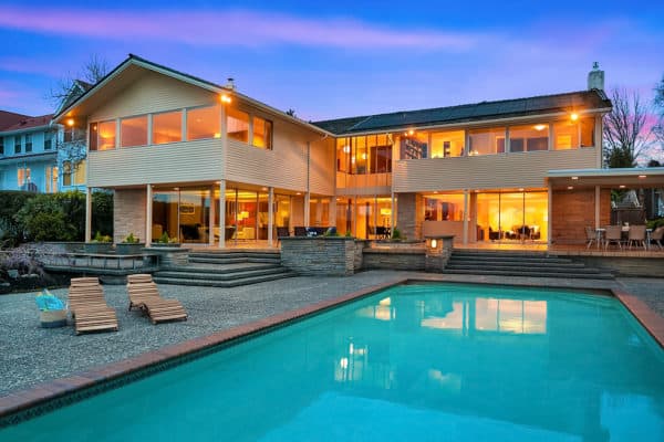
We love staging Queen Anne houses. This Craftsman house stood among the other houses. The front porch, the windows, and the original millwork were in great condition. You could feel and tell that this home was cared for by the homeowner. We wanted to keep the design of this Queen Anne House clam, muted, and sophisticated. Therefore we felt a transitional design was the best choice for this Queen Anne home.
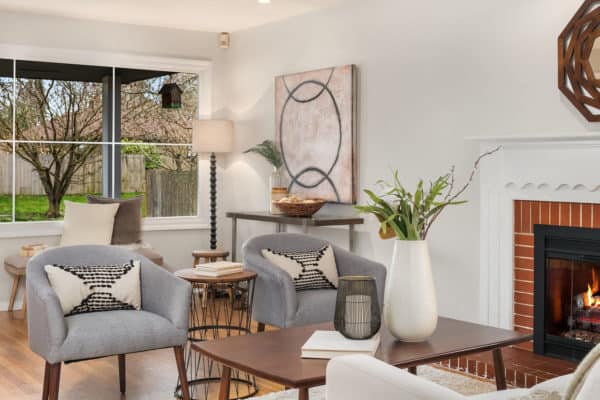
With any transitional design, the color palette is neutral. The layering of textures and colors creates a rich and sophisticated look that is timeless. This is why transitional styles are and showrooms like Restoration Hardware Store or Pottery Barn are so popular. As soon as you walk into these showrooms, you feel a sense of calm. This is because of all soft neutral color palette and the sense of continuity. We created the same feel for this Queen Anne house.
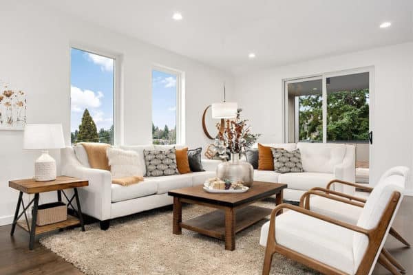
Two sofas made the living room look spacious and we still kept the footpath open and clear.
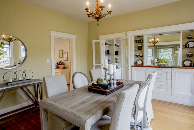
This mirror placement was perfect since it brought the outside in.
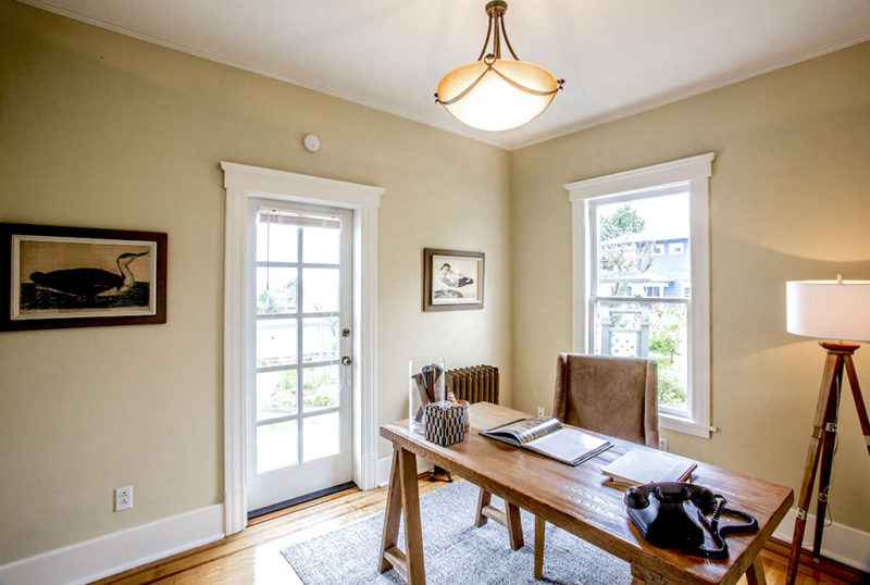
A simple home office with repeated muted colors and light wood. This room naturally flowed into other rooms.
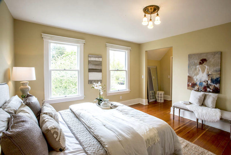
This master bedroom had a funky space. So we added a tall mirror and stool to suggest a dressing area.
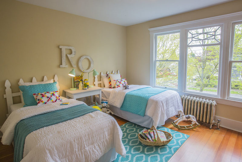
Since this house had only three bedrooms, we designed one of the larger bedrooms with two twin beds not to only showcase the size of the room, but to show that you can have two kids in this room.
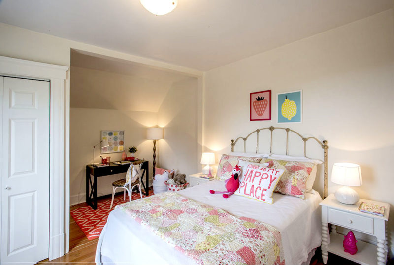
Again, this room had a funky space. We chose a desk and chair to show a homework space. Having multiple functions for rooms is always a good thing.
This house was sold with multiple offer and way above asking price, all cash, in just days. This was another staged home by us that the buyers wanted to buy our furniture pieces – and we always love that. Transitional designs and Queen Anne homes are two of our favorite things.
Feel free to share this post:


