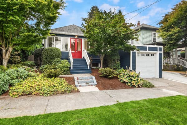
Home staging is not just about bringing furniture into a home. It has a lot to do with creative problem-solving. Every single home, no matter how high end, has its flaws. Therefore, home stagers have to think outside of the box to make each home look its very best. It’s our job to take the homeowners needs and constraints into mind and come up with a design that will work best for their home and help it sell quickly and for higher than asking price. This process is absolutely crucial in more dated homes. In this Bellevue rambler, we had to create a beautiful design to showcase this home’s amazing potential.
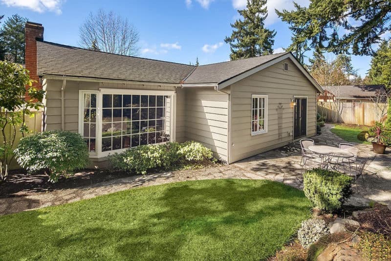
About The Home
This midcentury rambler was on the market for the first time this spring in over 40 years. Because its owners lived in it for decades, some of its features were very dated. Bold floral wallpaper covered most of the walls and the owners had remodeled the bathroom in the 1980s. The home itself was charmingly built and had serious potential but we needed to convince the prospective buyers of that with our design.
Step One: Creative Problem-Solving Around the Home’s Weaker Points To Minimize Negative Impressions
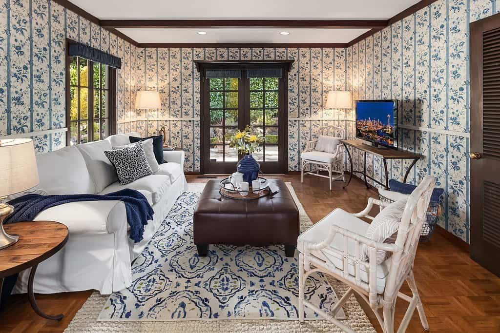
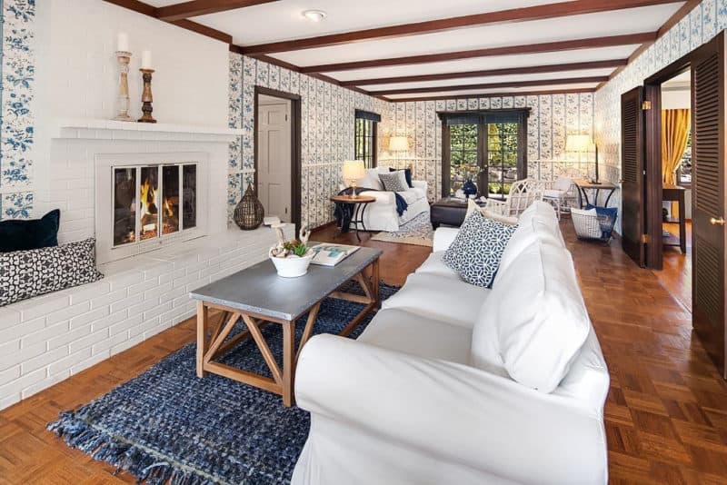
Our client was moving into a retirement home and changing the blue floral wallpaper was not an option. Most buyers look at the MLS photos online before deciding to view a home. So we needed to make sure that our staging made the home’s dated features work—or at the least look less distracting. We decided to embrace the wallpaper and utilize it to create the base of our design. To accommodate its busy pattern and the parquet hardwood flooring, we made our staging very simple. Our color palette came from the walls so our design worked nicely with and tamed the floral paper. We brought in white furniture to lighten up the room and contrast with the blue on the walls. Our accessories were the same shade of blue on the walls which made the room looked cohesive and the wallpaper purposeful.
We broke up the living room into two zones: one for entertaining and the other for casual relaxing by the fireplace.
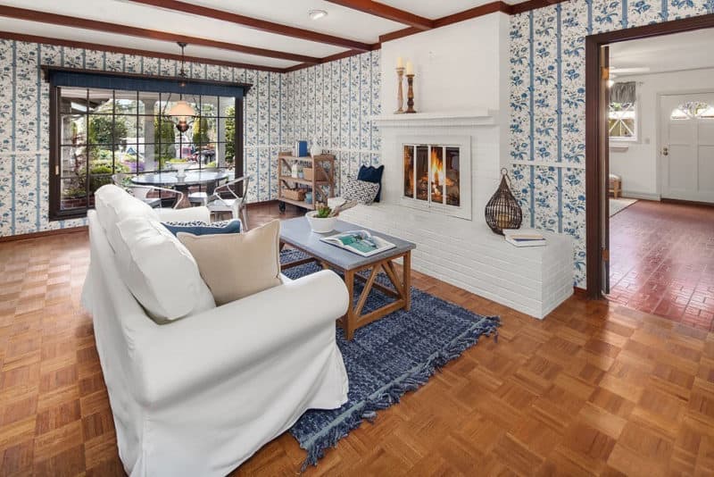
Defining the spaces in a home is essential to staging. It creates a lifestyle for the home that buyers can envision themselves living in. Instead of focusing on the dated wallpaper, buyers now could picture themselves cozying up next to the fire or having friends over for tea.
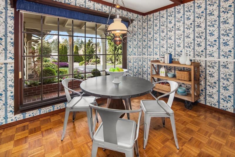
For the eating nook, we used solely solid color furniture. The metal chairs and small round table gave it an updated eclectic look. We used a wood tiered console table with accessories to break up the wall a bit and blend in with the hardwood floors.
Step Two: Highlighting the Stronger Points of the House to Demonstrate Potential
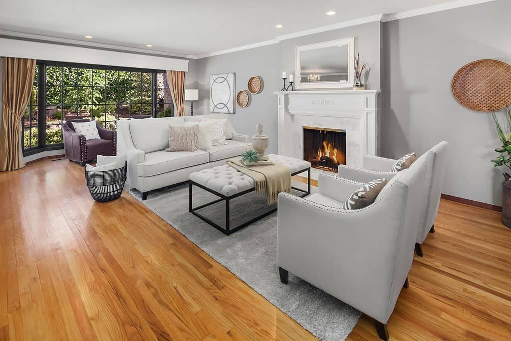
The family room didn’t have the floral wallpaper and we used the opportunity to paint the walls a nice neutral. The newly painted grey walls informed this room’s color palette to create a soothing atmosphere. It was crucial to make this room as soft as possible so buyers could envision what the rest of the house would look like once they removed the wallpaper. The space looked very fresh and bright by keeping everything simple. The large paned windows stayed the focus while we continued a mostly solid-color design.
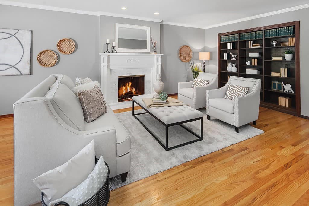
In order for this home to sell, it was crucial to tone down the busyness of the walls so the house didn’t look so dated. Not just any furniture or design would do. Our simplistic transitional design in the space made the home look very sophisticated even if some of the rooms’ wallpaper made the house look a bit chaotic. By creative problem-solving, we minimized the drawbacks of the home and highlighted all of its positive features. We made the distractions less distracting so the targeted buyers could focus on the great foundation of the home and see its potential. Our creative problem-solving worked and the staging investment paid off: STAGED AND SOLD!
Feel free to share this post:

