Tour of Midcentury Laurelhurst Luxury Home
Kitchen
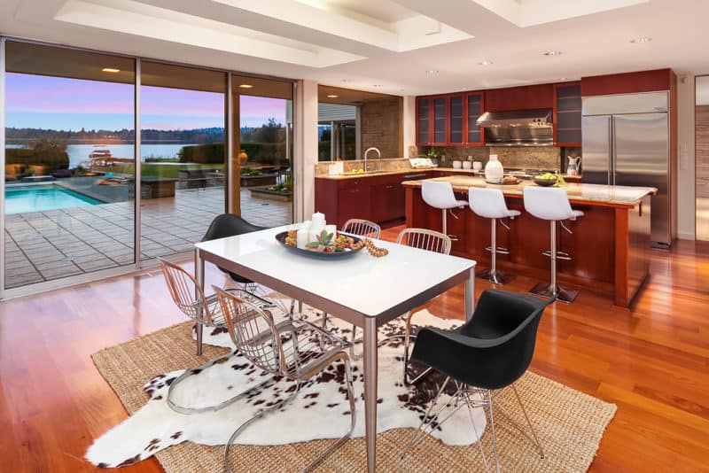
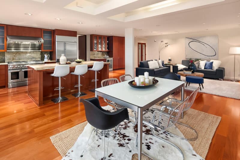
Being a boutique-style staging company, the smaller details matter to us. This has led us to collect real Midcentury pieces over the years at estate sales and vintage shops. We used some of these pieces in our stage such as in this space. Metal Midcentury chairs made the informal dining area next to the kitchen very hip.The chairs matched the metal finishings on the table and stood out against the Midcentury Eames armchairs.The simplicity of metal chairs and their sleekness allowed buyers to focus on the home’s amazing views and swimming pool outside.Then, we added a cowhide rug over a sisal to add interest.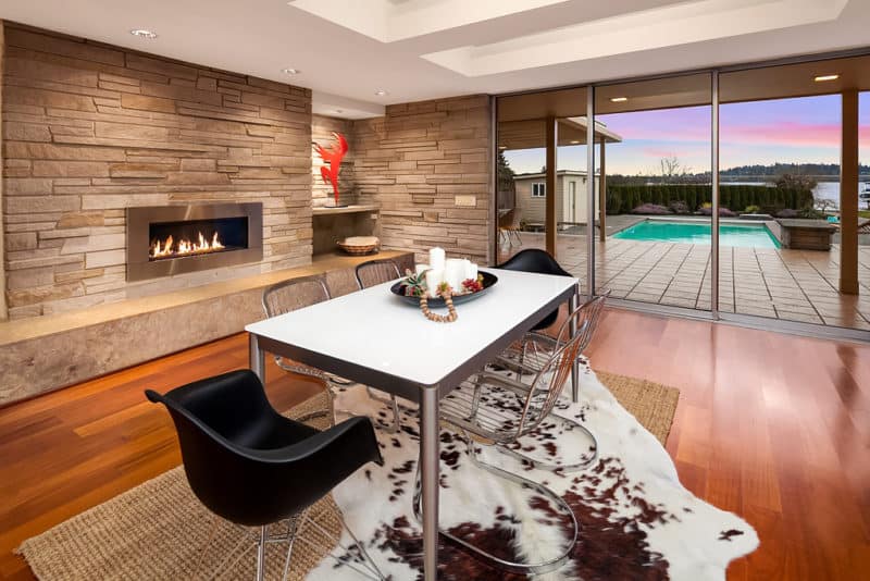 For the breakfast bar, we used Midcentury-inspired barstools reminiscent of Eames chairs. We chose white ones to lighten up the kitchen and contrast with the red color wood.
Family Room
In the family room, we added dark grey sofas to contrast against the white walls. Pops of blue brought in the tones from the lakefront views outside. Then we hung up a custom painting by a local artist we work with to make a bold statement.Peg-legged furniture and a tree trunk coffee table added the Midcentury touch.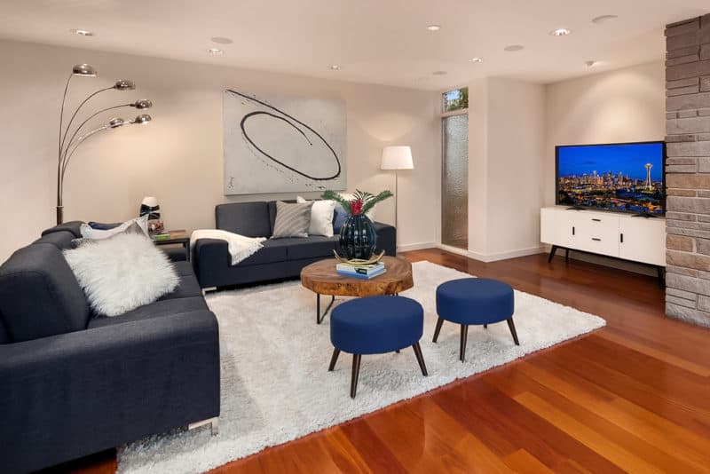
Living Room
We wanted to make sure the living room was very sophisticated. As a boutique staging company, we went the extra mile and commissioned more custom art that used the exact color of the wood wall we hung it on. It also went well with our Midcentury tufted leather accent chairs, though it’s a bit harder to see in a photo. We used off-white sofas with low backs to prevent the furniture from blocking the home’s amazing views.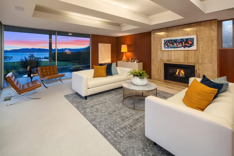
Games Room
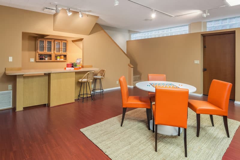
As we staged the rest of the house quite formally, we wanted to make the bonus room really fun. Therefore, we used warmer colors and a lot of bright oranges to add energy to the room. The orange leather chairs added an extra pop of contrast with the white Midcentury tulip table.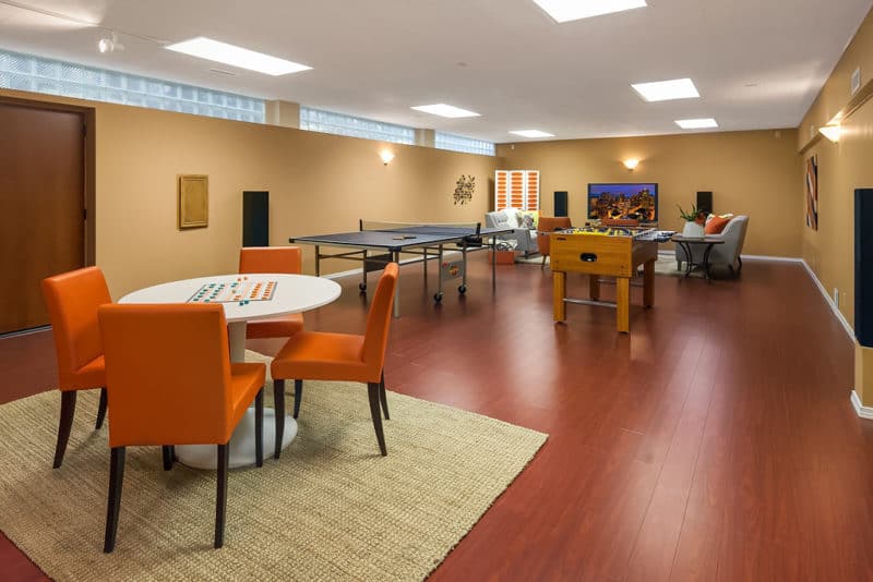 As this games room catered more towards children, we made the built-in bar a kid’s pretend restaurant to play in.
Home Office
We chose to design the home office as understated yet very sophisticated. We used Midcentury-inspired swivel chairs and created a ‘his and her’ desk arrangement. The small sofa suggested a place for reading.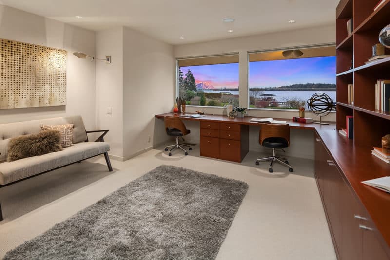
Dining Room
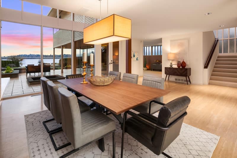
For the dining room, we kept things simple. We placed a neutral color area rug to anchor the space. We chose one with patterns to add some interest to the space. Then we used a simple table and light grey leather dining chairs so buyers could focus on the wood walls—a delightful feature common in Midcentury homes.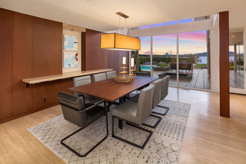 Home staging is all about presenting buyers with their potential future lifestyle. Buyers of this large luxury home will want to entertain often and we made sure to showcase this Midcentury house’s potential. You can see outside to Lake Washington and further gathering spaces outside from the formal dining area.
Outdoor Living Spaces
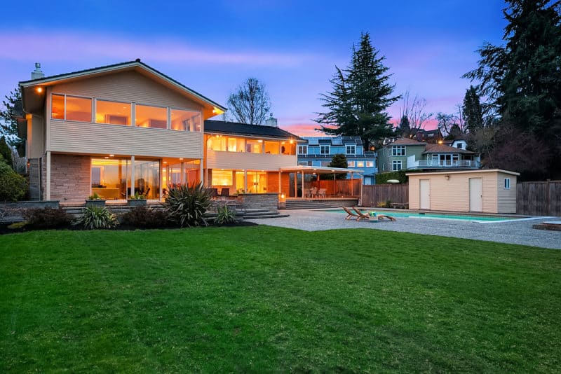
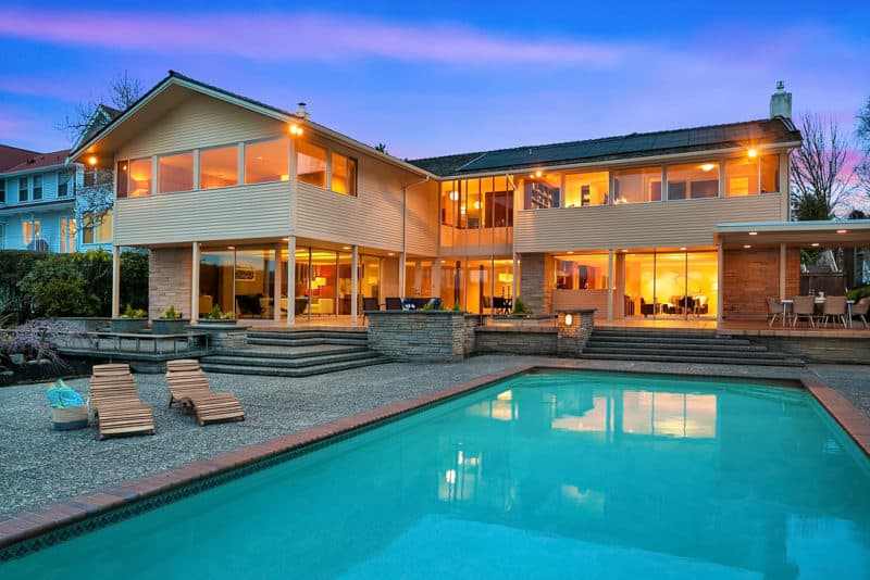
The outside of the home with a large swimming pool and a dock on Lake Washington was a major feature of the house. We wanted to show off this aspect of the home’s lifestyle. Because this home had such a large patio, we created multiple spaces outside that people could sit and talk. Below, we used a simple yet chic outdoor dining set that fit six people perfect for hosting pool party luncheons.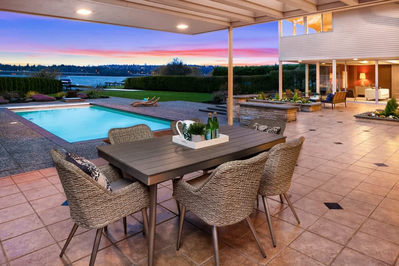
Bedrooms
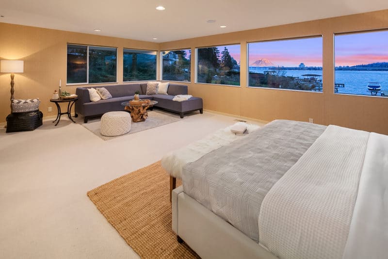
We kept the master bedroom soft and muted to provide an atmosphere of relaxation. The large tufted headboard made a grand statement.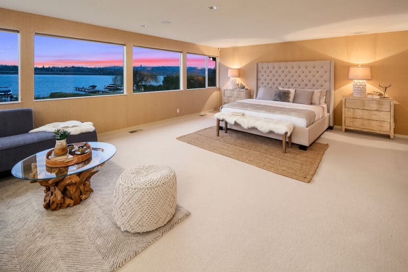 To showcase how large the master was, we added a sectional sofa next to the windows with the view of Mount Rainier and turned the once neglected corner into a functional space.
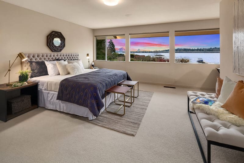
 We made the guest bedroom feel like a chic hotel with luxe bedding and footstools at the end of the bed.
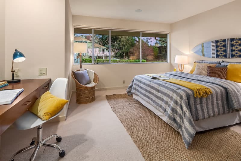
 The pops of yellow, the surfboard, and the patterned bedding made this teen room fun and hip.
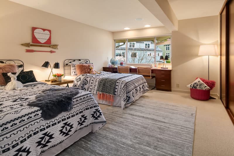
 This shared kid’s room we created looked really elegant. We kept things mostly monochromatic with touches of pink to soften the room and make it girly. When we design our kids rooms we make sure they look sophisticated while still being fun!
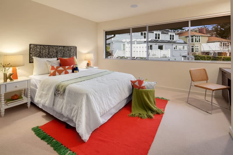
 In this kid’s room, we decided to use white bedding to contrast with the bright oranges and greens we brought into the room. This created a lively atmosphere perfect for kids.
 As you can see, our stage breathed life into this once tired looking house. By bringing in colors, hip Midcentury furniture, and by creating so many well-designed entertaining spaces we made this Midcentury Laurelhurst luxury home into the sophisticated house it deserved to be.
]]>
Feel free to share this post:

