As the new year approaches, color companies are releasing their shades for the upcoming year. In our previous blog, we wrote about Pantone’s shade of the year, Ultra Violet. Now, Sherwin Williams has announced Oceanside as their color of the year for 2018.
‘Seas’ the day with Oceanside
Oceanside SW 6496 is a rich blue with green tones that gives off an atmosphere of regal relaxation. Blue radiates calmness and tranquility; it is perfect for people who want to transform their homes into a retreat from stress in the outside world. What makes Oceanside so special, is its jewel tones that give it depth. Because of this depth, Oceanside packs an extra punch to the serenity blue provides. It brings out the mystery of the ocean, adding intrigue to any room.
“Its green-meets-blue tone can also boost creative thinking and clarity of thought in a home office, or invite meditation and introspection into a bedroom or reading nook.” -Sherwin Williams
This beautiful shade makes a great accent color for any home no matter what style you decorate your interior.
Ballard Home Staging With Oceanside Accent Color
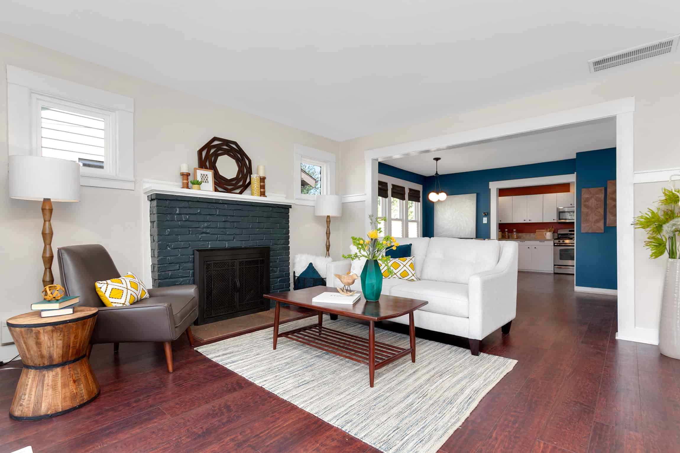
This summer, we staged a home in Ballard with a similar blue shade in our color palette. Even though Oceanside is a bold hue that may overwhelm some, it looks amazing when used as an accent color. It certainly makes an eye-grabbing statement, which is what is so great about the shade. With buyers viewing so many homes, you need your listing to stand out.
In this living room, we made sure to keep things light and bright to balance out the darker, intense blue. White trimming and a light colored wall to contrast were a must. This was especially the case because the home’s hardwood floors had a dark red tone. We then used a white sofa and area rug to anchor the room. The area rug also had some teal touches in it to bring everything together. On the sofa, we used Oceanside-colored scatter cushions to go with the accent wall and rug and added bright yellow geometric pillows to make the blue pop even further. Oceanside also looked beautiful with the home’s dark blue-grey fireplace surround.
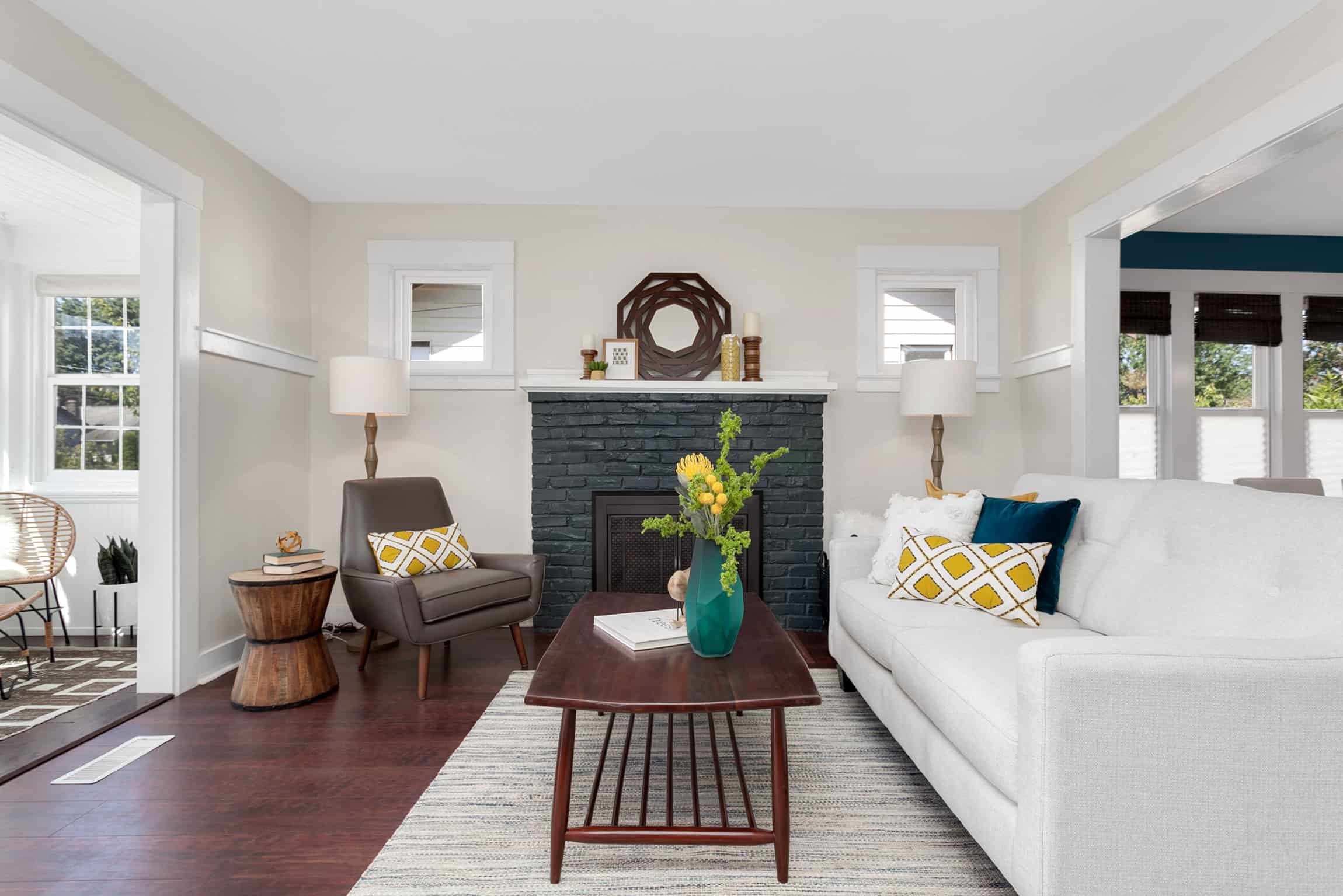
While transitional style usually incorporates a neutral monochromatic design, we made Oceanside work. Because we kept most of the decor either white or cream, the deep blue walls didn’t overwhelm the space and kept the design transitional. After we staged the home, the living room looked so spacious and airy even with the darker accent color.
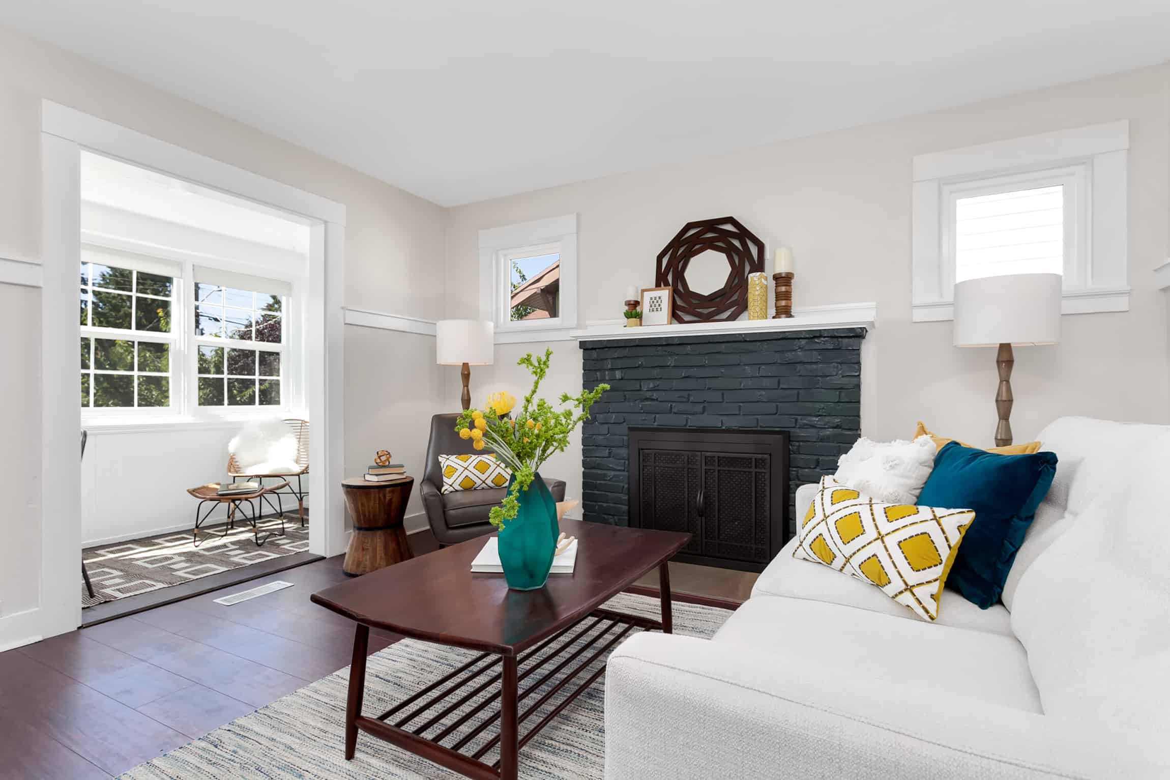
So if you are looking to add some excitement to your home or listing, we heartily recommend using Sherwin William’s 2018 color of the year.
Feel free to share this post:

