The exterior of the Pink House
A few weeks ago we had the opportunity to stage the most adorable Ballard home. We started calling it our pink house because the exterior was painted a pale salmon color. Initially, we were shocked to enter the home to discover that it had 12 foot ceilings throughout, as nothing on the sweet exterior hinted at this surprise.
As we went through the house, the shock wore off and we were able to see all of the fantastic updates that the owners did throughout the entire home. All of the bathrooms were updated with luxury finishes, the floors gleamed, and there was plenty of storage throughout. The home had several small design issues that were covering what a gem this home is.
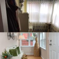
The moment we entered the home we fell in love with this entry space. By asking the homeowners to remove their curtains we instantly brought light back into the area. Painting the space in Benjamin Moore’s “Balboa Mist” was the next step. This color, a warm grey, brought freshness back into the entry. We had the owners leave us their bench and we ran with it from there. We filled the space in with spring green accents, and coordinating accessories to create a warm and inviting entry. Because the entry of a home sets the tone for the rest of the house, it’s so important that it properly reflects the feeling of the home.
Prior to staging, the main living area originally had three (!) gorgeous dark leather sofas, a side chair, a TV, a TV console, and a coffee table. While all of these pieces were lovely, they detracted from the airiness of the space, and over crowded a large space, hiding the room’s best features. To bring light back into the space, we suggested that the homeowners remove their heavy drapes. This was the first step to freshen the space up. From there, we brought in a cream sofa set with light green accents. The greens helped to add lightness to the space, while reminding home buyers that it is now spring in Seattle! Adding a large vase of tulips to our modern coffee table completed our light and springtime approach to this space.
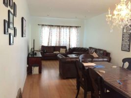
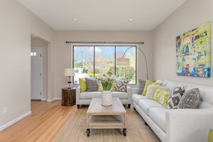
The main living area was split into two major zones, the living room and the dining room. We placed the dining table behind the living space and used all light furniture and accents. We also used highly vertical wall art. In doing this, we not only wanted to emphasize all the natural light of the space, but to draw the buyers eyes up towards the soaring ceilings.
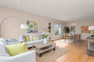
These key spaces allowed this gorgeous home to truly shine. The homeowners were shocked and delighted at the airy transformation of their home. Especially as they didn’t originally believe that their home needed to be staged in such a hot market. When all was said and done, our sweet pink house sold with 22 offers, and for 200k over asking price!
Feel free to share this post:


