Awkward windows. We’ve all experienced them. As renters or homeowners, unless you have been fortunate enough to design your home from the subfloors to the door hinges, you likely have experienced living in a home with a window in a less than ideal position. What do you do in these situations? As a staging company, we have a few tricks to help you embrace these architectural oddity. Here are our top tips for designing around awkward windows.
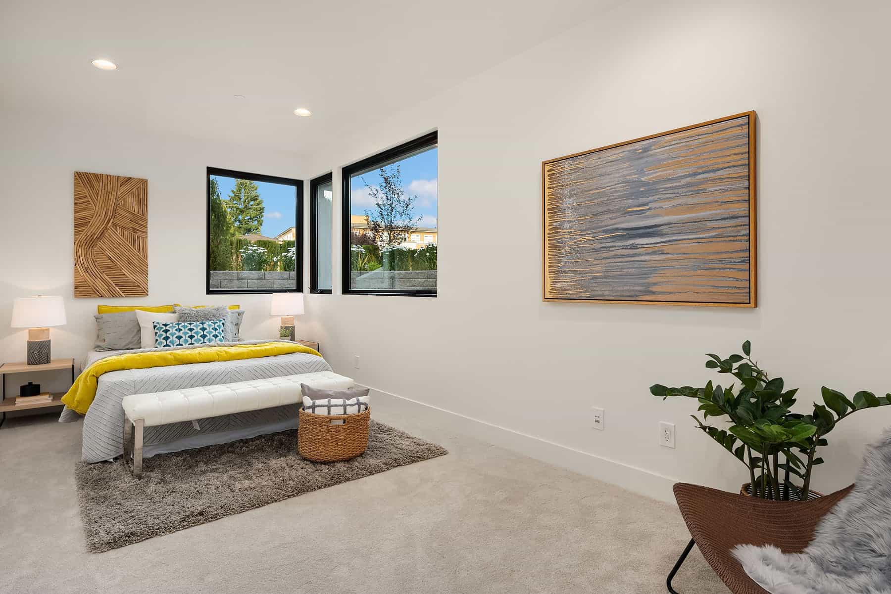
Corner Windows
When you find yourself in a situation where the bedroom in question has windows placed in this fashion, you are not left with many options. Our solution? Maintain a middle of the room focal point and balance the awkward window placement with a large piece of artwork as we did at this stage.
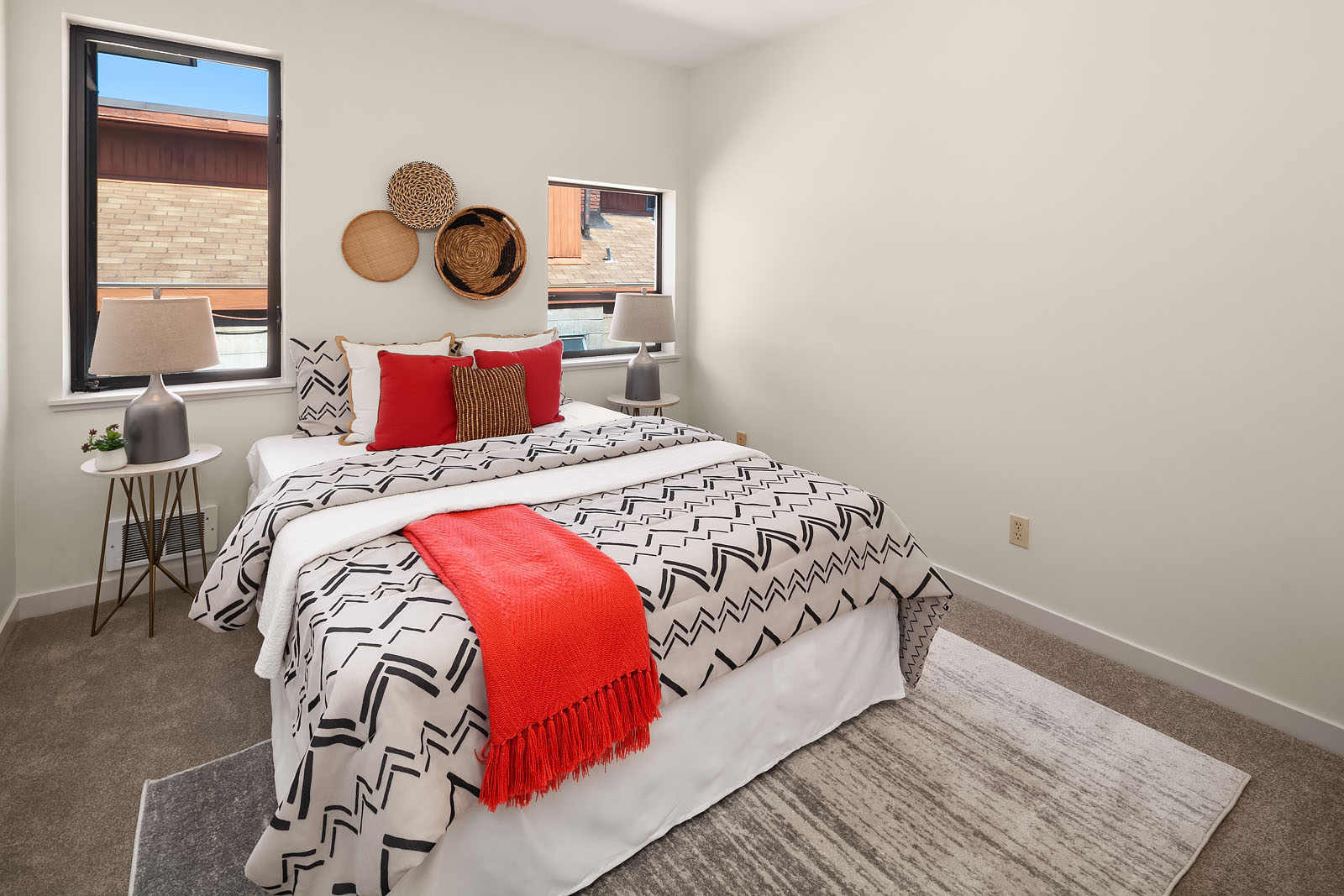
One Big & One Little
We are never really sure what the builder was thinking in scenarios like this. Maybe the window placement was aesthetically pleasing from the exterior and that was the focus? Who knows. We can’t move the window but we can offer a suggestion that will help make this obvious difference in size a bit more subtle. When you are furnishing a room with windows of different sizes stick with simple pieces and maintain balance with furniture selection and placement.
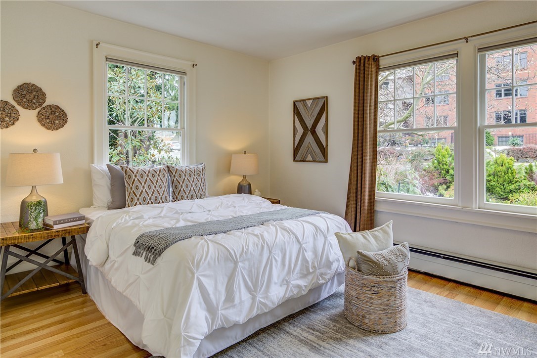
Smack In The Middle
Sometimes we find ourselves working in rooms where elements such as radiators limit the placement of furniture. This can require placement of a bed, for example, to be forced to a particular wall such as the one in this stage. In this situation, the window became our headboard and we embraced it.
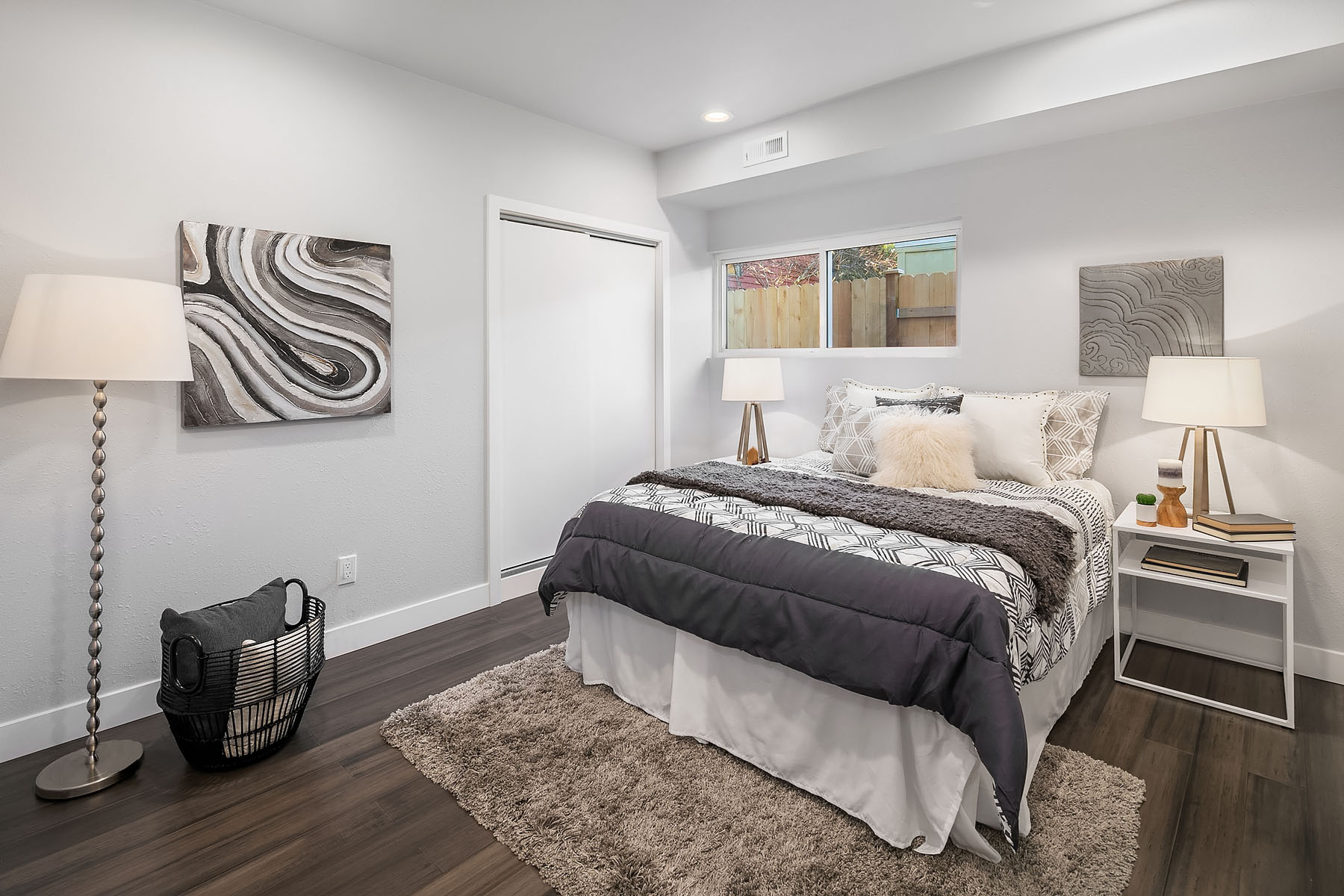
Off Center
The off center window. This situation for me personally is one of the most difficult to work with as I favor balance and symmetry in architecture and design. For this stage, we used artwork to offset the asymmetry and create balance in the room.
Written by Ashley Pasquale
Feel free to share this post:

